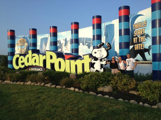
New Cedar Point Drive Sign

The pre-covid plans for the 150th were so energized. I remember Jason's energy when discussing the parade, Town Hall and even the new huge welcome sign. February 2020. Seems like a lifetime ago.
Admittedly, some of my melancholy is due to the conditions in Ontario, seriously threatening a second consecutive season of full closure for my home park of Wonderland. Full lockdown for one month starting tomorrow.
CP Coaster Top 10: 1. Steel Vengeance (40 rides to date) 2. Top Thrill Dragster (191 launches to date, 4 rollbacks) 3. Magnum XL 200 4. Millennium Force 5. Maverick 6. Raptor 7. GateKeeper 8. Valravn 9. Rougarou 10. Gemini


You need to check your history. Many amusement park signs of the past were grand, bright, colorful, and amusement-parky.
I think of Camden, Joyland, Lesourdsville, Coney Island, Kiddieland, Kennywood, Disney, and really, an endless number of parks that had/have fabulous signs visible from the street.
I’m not sure what *you* think an entrance sign is supposed to do (that made me laugh out loud) but what it is is a billboard. It’s the entrance. It’s entirely appropriate for it to be as fancy as possible.
RCMAC, how many of those parks actually had pretty much the same sign as Camden Park? Not necessarily with the clown, but that same basic design, with the stone base, the little neon signs for RIDES GAMES PICNICS or whatever, and a spaghetti board for messages? I remember seeing an old photo of the Americana sign and realizing it was pretty much the exact same sign as Camden's.
--Dave Althoff, Jr. (slightly disappointed that nobody seems to have 'got' the 20-years-ago joke)
    /X\      *** Respect rides. They do not respect you. ***
   /XXX\     /X\     /X\_      _     /X\__      _      _____
  /XXXXX\   /XXX\   /XXXX\_   /X\   /XXXXX\    /X\    /XXXXX
_/XXXXXXX\_/XXXXX\_/XXXXXXX\_/XXX\_/XXXXXXX\__/XXX\__/XXXXXX
RCMAC,
If your comment was directed at me then you didn’t bother reading page one at all. I specifically stated that I was all for having a fun and colorful sign, hence my negative comments regarding the cooperate looking sign they opted to go with. I grew up in Ohio with many wonderfully themed park signs so I know my history very well. (I laughed out loud at your comment about that as well, thank you for that)
If your comment was directed at someone else than I’d recommend quoting them in the future.
My apologies.
If you’d check page 1 you’d know I’ve been in on this thread from the second post. I don’t know how I was supposed to remember what you said back then. Your recent comment seemed out of the blue and I hope you can see how it may have been misinterpreted as the opposite of what you intended. In reading back through I don’t see many here that are happy with this new sign... at least not the one above you. Perhaps it’s you who needs to learn the quote feature as I have no idea who you were talking to.
Once again, I’m sorry.

I'm going around the internet stealing pictures, but just in case people have no idea what people are referring to, here is the retro signage with individual letters:

Fast forward to recently, and we see this:
When I think of "iconic park entrances", the causeway + Gatekeeper flying over the gates makes Cedar Point's total entrance breathtaking.
This is the sign on the road that tells you were to turn to get the park entrance, not the park entrance in and of itself. I've honestly never thought of this sign (in any of its forms) as saying "Welcome to Cedar Point!". Instead, it's always said, "The park is that way! You're almost there!"
Then you hit the point when you can see the epic skyline on the causeway....that's where the welcome to Cedar Point begins.
But yea, make a change...some will hate it, some will be OK with it, and some won't even notice. I guess I'm in group B.
To the original post, beauty is in the eye of the beholder. I always thought those poles looked a little goofy. But I didn't really care, because the entrance is <--- that way. Says so right there on the sign...
Promoter of fog.

You must be logged in to post