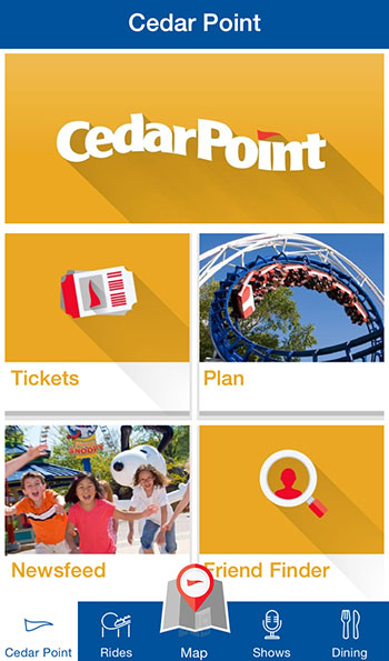
Website and Mobile Updates
- More
- 1 of 2
- 2
Doesn't look like their Android app update has landed at the Play Store, as it's still showing the old one, last updated in 2013.
EDIT: Never mind. The old accesso app is still there, and that's where I landed via the most relevant Google search result. And their link at CP.com is broken.
Brandon
The website update is long overdue. I hope the park websites update soon. The corporate website uses responsive design which is the way to go these days. Google just recently changed their rankings policy for mobile sites, this could be a response to that to avoid losing rankings.
I just downloaded the app and it's still the old crappy one. Looks like it hasn't got to Android yet.
Brian
Valravn Rides: 24| Steel Vengeance Rides: 27| Dragster Rollbacks: 1
The Cedar Fair logo is the old Visual Studio logo. Seriously.


Jeff - Advocate of Great Great Tunnels™ - Co-Publisher - PointBuzz - CoasterBuzz - Blog - Music
I just downloaded the new app. While it is an improvement over the old one, I'm really not that impressed with it. It's basically just information that I can easily find elsewhere, like on their website, but this is a better alternative than using their terrible mobile site. I think they should find a way to put wait times in there, or some other features that could be useful while in the park. On top of that, it loads a little slow and it's a data hog. I was only using for a few minutes and it already gobbled up 35MB. I hope they add more to it with future updates and make it more data efficient.
Brian
Valravn Rides: 24| Steel Vengeance Rides: 27| Dragster Rollbacks: 1
That's because most "apps" are just the same thing you could get on a web site. Hopefully there are web updates coming, because it's pretty weird in 2015 to see sites look like this on a phone. I mean, even PointBuzz is responsive, and we update like once every 8 years. :)

Jeff - Advocate of Great Great Tunnels™ - Co-Publisher - PointBuzz - CoasterBuzz - Blog - Music
I've been saying that for a while. The parks website looks dated. As I said above, Google will dock your search rankings on mobile devices if your site isn't mobile friendly. I hope that gives some places with outdated sites an incentive to update. But I think they could put wait times into the app, and maybe food ordering or make reservations at a sit-down restaurant. I feel like there is more that can be done with the app.
Brian
Valravn Rides: 24| Steel Vengeance Rides: 27| Dragster Rollbacks: 1
Thabto said:
On top of that, it loads a little slow and it's a data hog. I was only using for a few minutes and it already gobbled up 35MB. I hope they add more to it with future updates and make it more data efficient.
That's likely just the initial download of artwork, map, etc.. Once that's done, there's likely very little data usage.
The app is an improvement, but yeah, lots of work to do yet. The artwork for coasters and thrill rides are swapped, and the "interactive" map just barely qualifies as interactive, in the sense that you can turn on and off markers for different categories. Clicking on them doesn't give additional info, as one might expect (height requirements for rides, menu items for eateries, etc.).
Brandon
Thabto said:
I've been saying that for a while. The parks website looks dated. As I said above, Google will dock your search rankings on mobile devices if your site isn't mobile friendly.
I really don't think there's much risk for Google ranking anything other than the official site as the authoritative source of CP information.
Jeff - Advocate of Great Great Tunnels™ - Co-Publisher - PointBuzz - CoasterBuzz - Blog - Music
Probably not if someone searched Cedar Point information on Google. If the old PointBuzz was still up, it could've taken a hit with search rankings with that search query. But if someone typed in amusement parks in Google, Cedar Point might get ranked lower than parks with a mobile friendly website.
Brian
Valravn Rides: 24| Steel Vengeance Rides: 27| Dragster Rollbacks: 1
In general the new Android app looks pretty good with the exception of a few areas. When clicking on certain links, it takes you to the desktop CP site instead of displaying the data in what appears to be the Android WebView service that they are using for the majority of the app. That just seems kind of weird and disjointed. Presumably that will be changed when the main site is updated to be more mobile responsive. Also, the live shows calendar seems messed up, with the Brew & BBQ showing up on multiple days in June. There is also a GPS bug where the GPS stays on sometimes even when the app is in the background. For what the app uses the GPS, the GPS needs to go off when the app is put in the background to save battery.
I'd rather be in my boat with a drink on the rocks,
than in the drink with a boat on the rocks.
This is massive pet peeve of mine but I really hate this style of website. I'm not willing to believe that laptops and desktops are so on their way out that everything has to be essentially tablet-formatted from here on out.
Among other things, I've just never liked having to scroll endlessly to try to find what I want versus having distinct pages. Hate it on blogs and forums, hate it on main websites too.
Also not entirely sold on the new Cedar Fair logo yet.
- More
- 1 of 2
- 2
You must be logged in to post
